Theme Customization
The Theme tab allows you to personalize the visual appearance of your bot, ensuring it aligns with your brand or desired aesthetic. Customize fonts, colors, backgrounds, and other elements to enhance the user experience.
Global Settings
The Global section lets you configure overarching visual elements, including bot branding, font, and background.
Progress Bar
The Progress Bar visually indicates a user’s progress through the bot, improving engagement by showing advancement and completion status.
To enable the progress bar:
- Go to the Theme tab in your bot’s dashboard.
- Locate the Progress Bar option in the Global section.
- Toggle the Enable Progress Bar switch to activate it.
| Option | Description |
|---|---|
| Placement | Choose where the bar appears: Top or Bottom. |
| Background Color | Set the color of the bar’s background. |
| Color | Define the color of the progress indicator. |
| Thickness | Adjust the height of the bar in pixels (default: 4). |
| Position When Embedded | Control the bar’s behavior when the bot is embedded on a webpage (see details below). |
Position When Embedded
Adjust how the progress bar behaves in an embedded bot:
fixed: Anchors the progress bar to the top of the browser window, keeping it visible even when the chat container scrolls.absolute: Positions the progress bar at the top of the embedded chat container, scrolling with the chat.
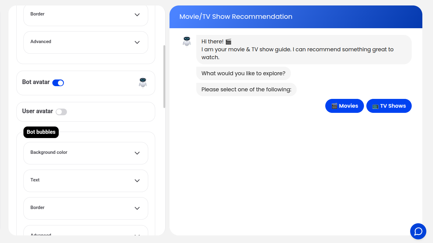
Chat Customization
The Chat section allows you to customize components like avatars, text bubbles, and input fields.
Changing the Bot Avatar
Click the bot avatar to upload a new image:
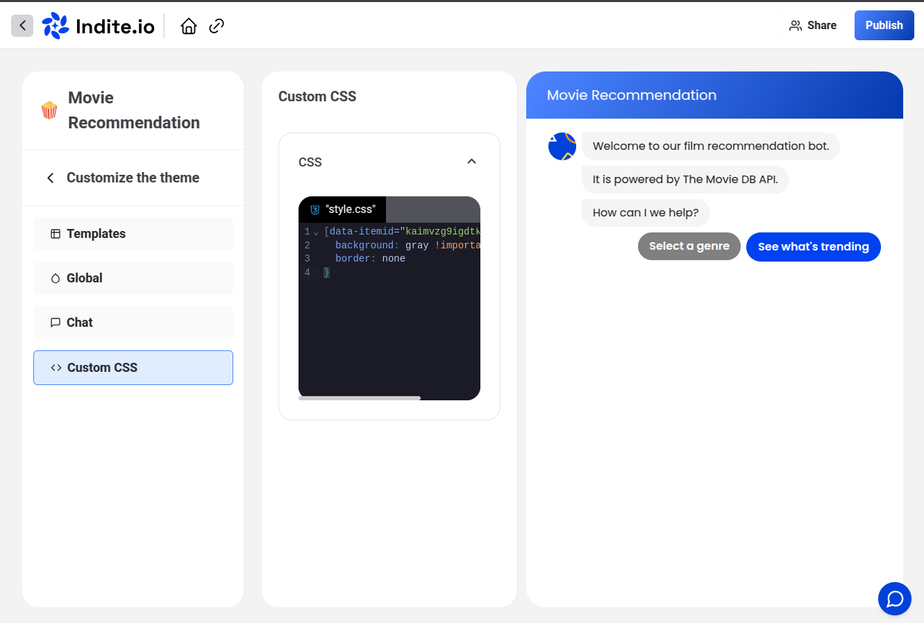
Custom CSS
For advanced customization, add Custom CSS to style specific elements of your bot. To target an element, right-click it on the Theme page, inspect it, and note its class or ID:
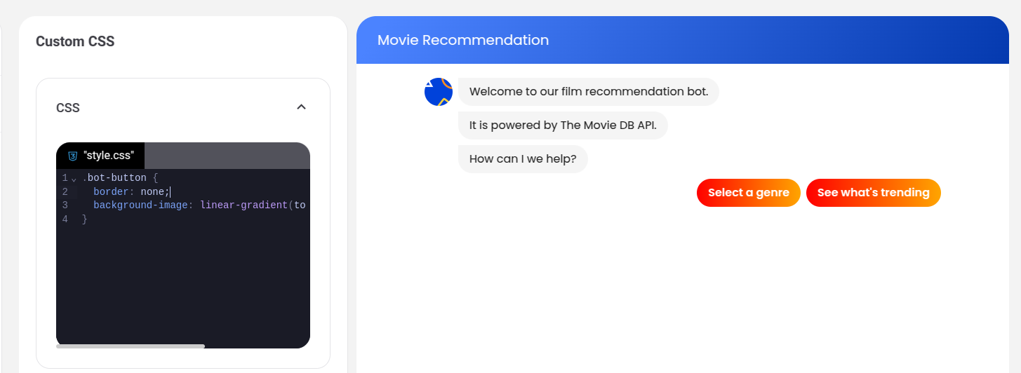
Example: Styling Buttons
To make buttons more rounded with a gradient background, add the following CSS:
.bot-button {
  border-radius: 40px;
  background-image: linear-gradient(to right, #e052a0, #f15c41);
  border: none;
}
Resulting appearance:
Customizing a Single Button
To style a specific button, use its unique data-itemid attribute. Inspect the button to find its ID:
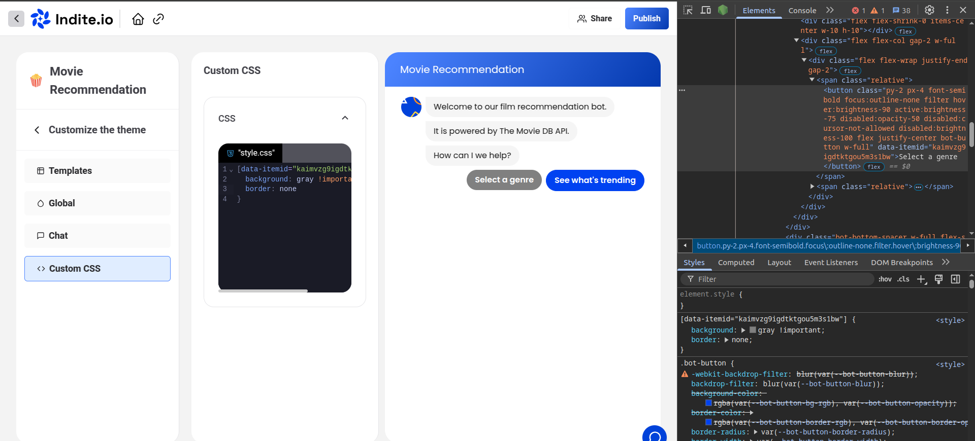
Example CSS to change a single button’s color:
[data-itemid="cl3iunm4p000f2e6gfr8cznnn"] {
  background-color: gray;
  border-color: gray;
}
Ensure your CSS selectors are specific to avoid unintended styling changes. Test custom CSS in the Theme preview to confirm the desired appearance.