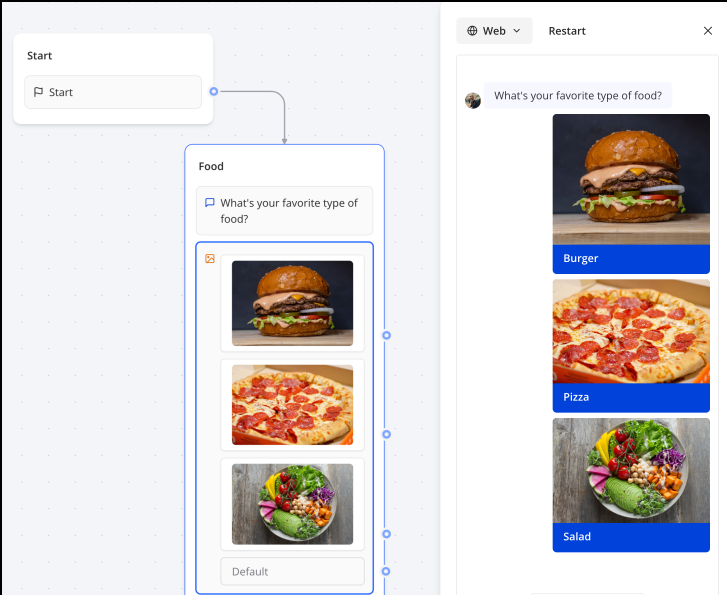
Picture Choice Input Block
The Picture choice input block allows you to offer your user predefined choices illustrated with a picture, either single choice options or multiple choices. This visual approach makes decision-making more intuitive and engaging for users.
Key Features
- Visual Selection: Present options with accompanying images for better user engagement
- Single or Multiple Choice: Configure whether users can select one or multiple options
- Custom Labels: Add descriptive text below each image for clarity
- Dynamic Items: Populate choices dynamically from variables or API responses
- Responsive Grid Layout: Options display in an attractive grid that adapts to screen size
Flow Editor
Configuration Options
| Option | Description |
|---|---|
| Is multiple choice | Toggle to allow users to select multiple options |
| Is searchable | Enable search functionality when many options are available |
| Submit button label | Customize the text on the submit button (for multiple choice) |
| Dynamic items | Populate choices from a variable containing an array of items |
| Save answer in variable | Store the user's selection for use later in the flow |
Adding Picture Choices
For each choice item, configure:
- Image: Upload an image or provide a URL
- Title: The label displayed below the image
- Value: The value stored when this option is selected (can differ from title)
Example Usage
Product Selection
Create a visual product catalog:
- Add a Picture Choice block with your product images
- Set titles to product names and values to product IDs
- Enable multiple choice if users can select several items
- Store the selection in a variable for order processing
Style Quiz
Build an interactive style preference quiz:
- Display different style options as images
- Use single choice mode for each question
- Collect responses to personalize recommendations
Service Selection
Let users choose services visually:
- Upload icons or images representing each service
- Add clear labels describing each option
- Route users to different flows based on their selection
Best Practices
- Use Consistent Image Sizes: Ensure all images have similar dimensions for a clean grid layout
- Keep Labels Short: Use concise, descriptive labels that fit on one line
- Limit Options: Display 2-6 options for optimal user experience; use dynamic items for longer lists
- High-Quality Images: Use clear, recognizable images that represent the choice well
- Consider Accessibility: Ensure images are distinguishable and labels are descriptive
- Test on Mobile: Verify the grid layout works well on smaller screens
Explore the Buttons block documentation for advanced configuration options like dynamic items and conditional logic.