For styling beyond what the Global and Chat controls expose, the Custom CSS tab gives you a full CSS editor bound directly to your bot's stylesheet.
Finding the Right Selector
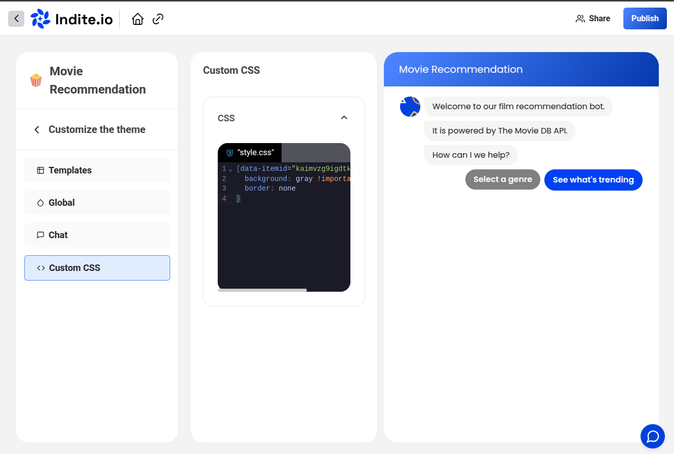
Right-click any element on the Theme page's live preview, choose Inspect, and note its class or data-itemid:
Example: Styling Buttons
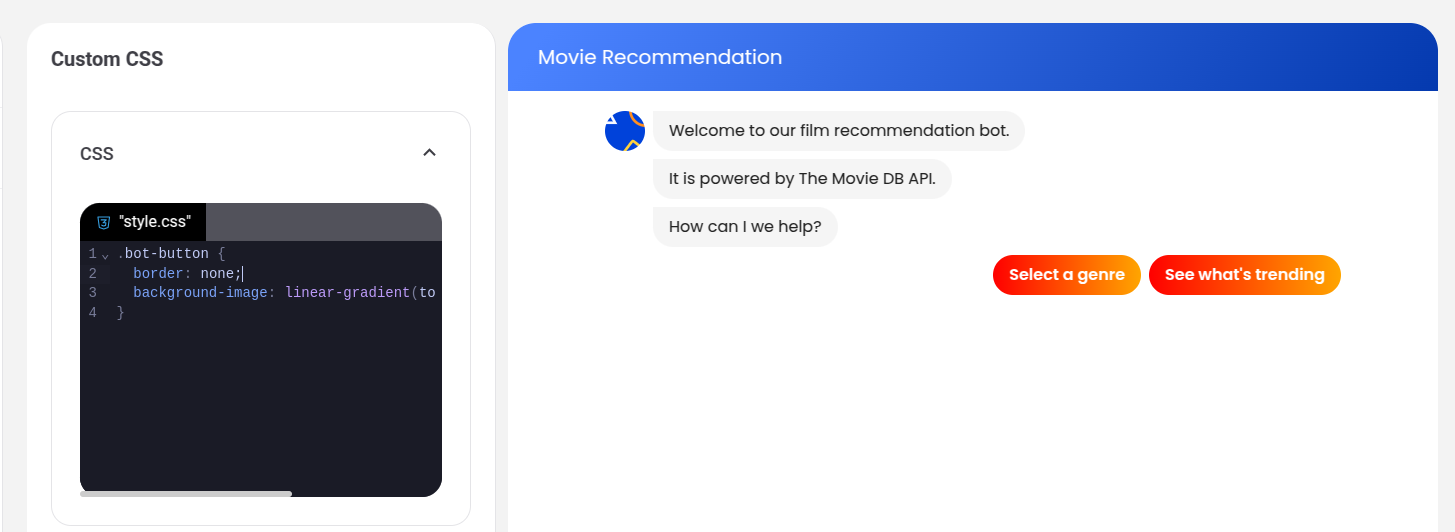
.bot-button {
  border-radius: 40px;
  background-image: linear-gradient(to right, #e052a0, #f15c41);
  border: none;
}
Customizing a Single Element
To target one specific button (rather than every button), use its unique data-itemid:
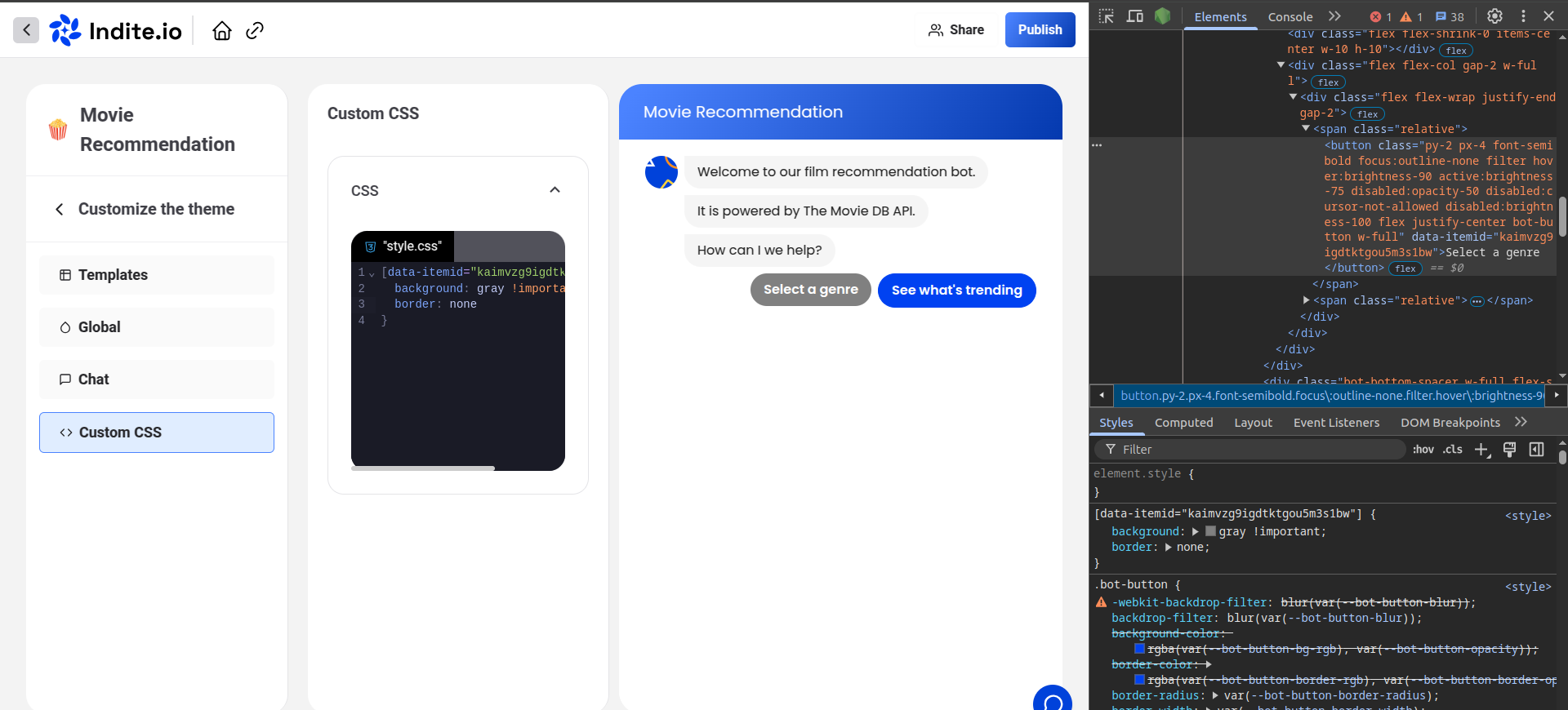
[data-itemid="cl3iunm4p000f2e6gfr8cznnn"] {
  background-color: gray;
  border-color: gray;
}
More Examples
Custom chat container
.bot-chat-container {
  border-radius: 20px;
  box-shadow: 0 10px 30px rgba(0, 0, 0, 0.1);
  backdrop-filter: blur(10px);
  background: rgba(255, 255, 255, 0.95);
}

.dark .bot-chat-container {
  background: rgba(26, 32, 44, 0.95);
  border: 1px solid rgba(255, 255, 255, 0.1);
}
Animated message bubbles
.bot-message-bubble {
  animation: slideInUp 0.3s ease-out;
  border-radius: 18px 18px 18px 4px;
}

.user-message-bubble {
  animation: slideInUp 0.3s ease-out;
  border-radius: 18px 18px 4px 18px;
  background: linear-gradient(135deg, #667eea 0%, #764ba2 100%);
}

@keyframes slideInUp {
  from { opacity: 0; transform: translateY(20px); }
  to { opacity: 1; transform: translateY(0); }
}
Custom input field
.bot-input-field {
  border-radius: 25px;
  border: 2px solid #e2e8f0;
  padding: 12px 20px;
  transition: all 0.3s ease;
}

.bot-input-field:focus {
  border-color: #4450A6;
  box-shadow: 0 0 0 3px rgba(68, 80, 166, 0.1);
  outline: none;
}
Test custom CSS against the live preview on the Theme page. Prefer specific selectors (or data-itemid) to avoid unintended side effects on other elements.