The Chat tab personalizes the chat interface itself — the container, avatars, message bubbles, buttons, and input field.
Container
Controls the outer chat window:
- Max width / Max height — a number plus a unit (
px,%,vh,vw) - Background — a background color, or transparent
- Text — text color (defaults automatically based on whether the container background reads as light or dark)
- Border — roundness (none / sm / md / lg / full / custom px), thickness, color, opacity
- Advanced — opacity (hidden if the background is transparent), blur in px (shown only when opacity is below 1), and a preset shadow style
Bot avatar / User avatar
Enable the avatar switch, then click the avatar to upload an image. Supports uploaded images, external URLs, or an emoji as the avatar. The User avatar (shown next to the visitor's own messages) uses the same control and is disabled by default.
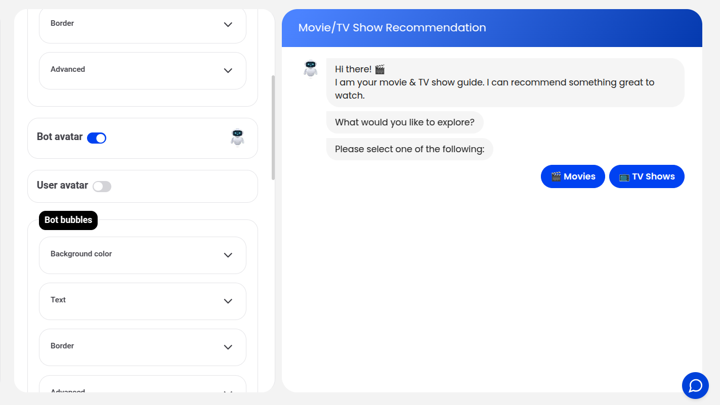
Bot bubbles / User bubbles
Each message-bubble type — Bot bubbles (host) and User bubbles (guest) — has the same Background / Text / Border / Advanced controls described under Container above, applied independently.
Buttons
Styles every button rendered in the chat (choice buttons, etc.) using the same Background / Text / Border / Advanced structure. Border color defaults to the button's own background color.
Inputs
Styles the text input field with the same Background / Text / Border / Advanced controls, plus:
- Placeholder color — color of the input's placeholder text
Every color and border field here can be overridden per-element with Custom CSS if you need something the visual controls don't expose.